Discover ModulateCSS
Don't look any further
Create pure CSS, rock solid, endless scalable design systems that can be integrated anywhere.
Why Modulate CSS?
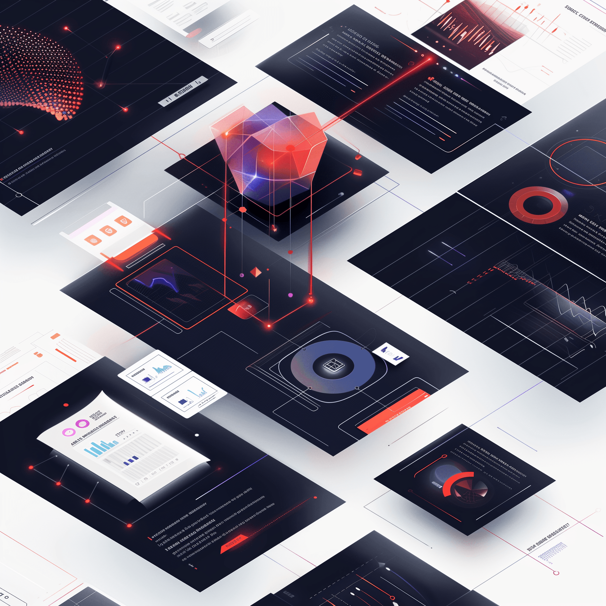
Enhance Your Workflow with ModulateCSS
Discover the numerous advantages of integrating ModulateCSS into your development process.
Innovation at Its Core
Advanced Technologies
Rely on a parametric approach that takes full advantage of modern CSS, including fluid resizing and custom properties, to significantly improve efficiency, maintainability and overall project performance.
Organized and Efficient
Clear and carefree structure
Use a layered and modular CSS organization, simplifying maintenance and ensuring responsive designs. Stop namespacing conflicts, providing a clean and efficient structure that is easy to navigate.
Effortless Integration
Perfect CMS Integration
Avoid complex logic or mapping in the CMS templating language to offer content editors a choice of layouts and color schemes. The lack of need for build tools also simplifies integration with all content management systems out there.
Rethink Responsive Design
Pure CSS Fluid Sizing
Transform how you adapt interfaces between mobile and desktop with the worlds first pure CSS implementation of locks.
Designed for developers and loved by designers. Achieve perfect fluid scaling using only native CSS. Make your site more adaptable, lighter and faster, without crutches.
/* Define screen size locks */
:root {
    --s-min: 400; /* Lower Lock: Min Screen Size */
    --s-max: 1400; /* Upper Lock: Max Screen Size */
}

/* Use fluid sizing */
h1 {
    font-size: var(--fs);
    --fs-min: 60; /* Minimum Font Size */
    --fs-max: 240; /* Maximum Font Size */
    line-height: var(--lh);
    --lh-min: 60; /* Minimum Line-Height */
    --lh-max: 240; /* Maximum Line-Height */
    ...
}Totally
Fluid
Reimagine Colors
Rock Solid Color Schemes
Effortlessly switch themes with Color Sets, allowing instant adaptation from light to dark modes with a mere class switch. Unlock design consistency with minimal effort.
Color sets ensure your site remains visually cohesive and striking across all platforms and devices. Enhance user engagement with a harmonious color experience.
<style>
    /* Define brand colors */
    :root {
        --c-white: rgba(255, 255, 255, 1);
        --c-text-black: rgba(0, 0, 0, .87);
        --c-text-white: rgba(255, 255, 255, .87);
        --c-primary-500: rgba(254, 94, 79, 1);
    }
    /* Patch color schemes */
    .csl-1 {
        --cs-background: var(--c-white);
        --cs-standard: var(--c-text-black);
    }
    .csl-2 {
        --cs-background: var(--c-primary-500);
        --cs-standard: var(--c-text-white);
    }
    article { background: var(--cs-background); }
    h1 { color: var(--cs-standard); }
</style>

/* Apply color scheme */
<section class="csl-1">
    <article>
        <h1>Headline</h1>
    <article>
</section>Matching
Colors
Simplify Layouts
Ultra Flexible Module Grid
Optimize your web design with ModulateCSS's ultra-flexible grid system that allows dynamic layout changes without changing the HTML structure.
Framed modules, fading images, extravagant layouts, easy reversal without breaking the parent grid. Layouts can be changed by replacing just one class while the DOM structure stays untouched.
<style>
    /* Define grid params */
    :root {
        --grid-width-max: 1600;
        --grid-columns: 12;
        /* ... */
    }
    /* Define a layout */
    .module-marketing-1 {
        --content-rows: 4;
        &.layout-1 {
            & section {
                grid-column: col-start 1 / col-end 5;
                grid-row: row-start 1 / row-end 1;
            }
            & figure {
                grid-column: col-start 7 / col-end 12;
                grid-row: row-start 1 / row-end 1;
            }
        }
    }
</style>

/* Apply the layout */
<section class="module-marketing-1 layout-1 module-grid">
    <section></section>
    <figure></figure>
</section>